Custom button class for specific blocks built with Lazy Blocks
I build a lot of custom WordPress themes and sites at AshWebStudio and for other companies I partner with. I used to build all my sites by heavily relying on ACF (Advanced Custom Fields) Pro. It has worked very well for many, many years for both myself and clients.
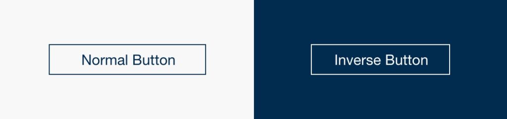
That all recently changed when I found Lazy Blocks – an incredibly easy way to create custom blocks for my custom themes (and it’s free!). For every theme, I define what a standard button looks like for the Buttons block which will usually appear in the theme’s default background color, usually white or something light. However, in many designs, it is not uncommon to need an inverse version of the button because it is appearing on a dark background. See below:
I have several blocks in my custom theme (the main home page banner, another one I called “left image” and a CTA (Call to Action) block that all use dark backgrounds and so will need the inverse version of the button style applied. Yes, you can set a custom class in the in the “Advanced” tab for your Buttons block. However, I like to make content management as easy as possible and almost certainly a client or whoever is editing the site will forget about setting this class for these specific blocks. The below PHP code makes use of the “render_block” filter to add the extra “inverse” class to all Button blocks that are in the initial array.
PHP to add the extra inverse class
add_filter( 'render_block', function( $block_content, $block ) {

	// Change these array values to the blocks you want to apply these to
	$inverse_button_blocks = array(
		'lazyblock/banner',
		'lazyblock/left-image',
		'lazyblock/cta'
	);
	if ( !empty( $block['blockName'] ) && in_array( $block['blockName'], $inverse_button_blocks ) ) {
		if ( !empty( $block['innerBlocks'] ) ) {
			foreach ( $block['innerBlocks'] as $inner_block ) {
				if ( $inner_block['blockName'] == 'core/buttons' ) {
					foreach ( $inner_block['innerBlocks'] as &$button ) {
						$block_content = str_replace(
							'wp-block-buttons',
							'wp-block-buttons inverse',
							$block_content
						);
					}
				}
			}
		}
	}

	return $block_content;

}, 5, 2 );
CSS for normal and inverse buttons
For a little additional help, here is the actual CSS I used:
.button,
.wp-block-button__link { transition: all .2s; display: inline-block; border: 1px solid var(--dark-blue); font-size: 16px; background: transparent; color: var(--dark-blue); padding: 8px 35px; text-decoration: none; cursor: pointer; border-radius: 0; }
.button:hover,
.wp-block-button__link:hover { background: var(--dark-blue); color: #FFF; }
.button.inverse,
.inverse .wp-block-button__link { border-color: #FFF; color: #FFF; }
.button.inverse:hover,
.inverse .wp-block-button__link:hover { background: #FFF; color: var(--dark-blue); }